

Today, we use an increasing number of visuals and iconography to relay messages – and surveys are no different. But why?
Kantar has run an extensive series of experiments over the past decade to explore the role of visuals in the collection of research data. In our research, we deconstructed how visuals work and broke down every element of the communication process. We tested how quickly visuals were processed compared to text, the curiosity they generated, and how they motivated people to consume and share the facts.
Here are some of our findings, and how we recommend applying visuals in your online surveys for better respondent engagement.
Visuals work
Simply put, visuals really do work! Surveys can be brought to life using visuals and icons. Information presented together with visuals can be up to twice as memorable as the same as information presented without them. There are two key components behind this.
- Visuals help to improve the attention paid by a respondent when answering survey questions, acting almost like adverts for the questions, engaging the respondent.
- Visuals improve the cognitive processing involved in reading the options within questions.
The human brain thinks in pictures
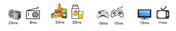
Human brains are designed to process imagery, and they can do it incredibly fast. In our experiments, we flashed visual material for fractions of a second to respondents, testing hundreds of icons and logos. We found the images could be processed at least twice as fast as the words used to describe them and many logos upwards of four times faster.
This indicates that people are more likely to take notice of visual information than text-based facts, because human brains derive meaning from visuals more efficiently. So, if a respondent is searching for information, a relevant visual is likely to help navigate them towards it more quickly.
Tips for using visuals
So how can you best use visuals and icons to better engage survey respondents? Here are 6 tips from our research:
1. Use visuals in repetitive questions
The use of visuals in scale-based questions is a particularly beneficial tool. This is partly because it reduces boredom, and helps respondents read the multiple options within a scale format more efficiently. It can also be much easier to interpret a visual scale. This enables people to answer questions in a more intuitive way and engage their feelings, rather than spending time processing options.
2. Keep them small
Icons and visuals take time to load. For practical reasons, we recommend keeping file sizes small so that they appear quickly in the survey process. The size also matters to the screen they appear on. Consider the multiple devices a respondent might view your survey on. A mobile screen has limited real estate for images, so they should not be overly elaborate to be displayed clearly.
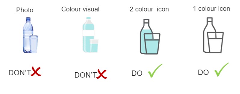
3. Be “literal” with your image selection
For visuals to be effective in their iconic form (i.e. when they are being used to signpost information) they have to be very accurate – literally “iconic” – and they have to be descriptive yet without any superfluous detail.
We found simple one or two color designed icons are selected far faster than the full color, more detailed icons. Color and detail can slow down processing information as our brains are distracted, looking for meaning in all the erroneous visual detail.
4. Balance visual simplicity and descriptive detail
Whilst too much color detail could make icons difficult to process efficiently, detail is often important in a research context. Adding too little visual detail can run the risk that the icon will misrepresent what it’s trying to convey. There’s a balance to be maintained between visual simplicity and descriptive detail.
5. Consider cross-cultural interpretation
It is always imperative to consider how a visual will be interpreted by others. In our experiments, we found many simple insights that demonstrate this cross-culturally. For example, in western markets the image of a carton or bottle of milk with a glass saw 100% recognition as milk. However, in India this dropped by 15%. In India, it is more common to receive fresh milk not in a carton or bottle. Visuals should be easily recognizable for all who may view it to be an effective survey tool.
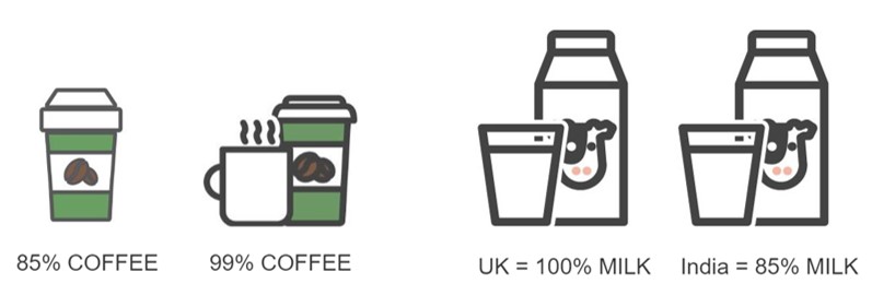
Beyond culture, this consideration is still important. In another experiment, we found that a visual of a takeaway coffee cup on its own was less powerful than a visual with the takeaway cup and a mug, with 9% more respondents recognizing the latter due to the way they consume their coffee.
6. Use them carefully! A poor choice of icon can mislead respondents.
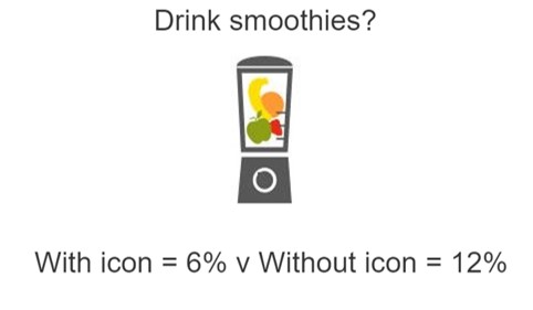
For all their power, the use of visuals and icons also come with a warning. The wrong visual can mislead and confuse respondents, having an adverse effect on how the question is answered. For example, we took a visual of a blender with fruit in and asked respondents if they ‘drink smoothies?’ Double the number of respondents interpreted the question better when no icon was used. In exploring further, it became clear that many people grab a smoothie off the shelf or from a café rather than whipping it up themselves. Take care in choosing the right visuals.
In summary
We know that people process visual information more quickly, that visuals help advertise and motivate people to consume information, and that visuals aid in recollection and encourage people to share what they learned. When all factors are combined, these findings create a multiplier effect.
When you consider some of the uplift figures from our research, the math speaks for itself. Take a typical visual that gets pre-attentively processed twice as fast, provokes 50% more curiosity to read, encourages 50% more reading, results in 50% more facts being recalled, and is shared 50% more = a well visualized fact has the potential to be 10 times more impactful than an un-visualized fact!
Learn more
Keen to learn more? Take the Using Visuals for Engagement on-demand training module in our Survey Design series now.